with the year 2020, graphic design trends have reached an important milestone. It’s the dawn of a new decade, and graphic design is poised to reach new heights as designers begin to define the era. There’s a feeling in the air that anything can happen—that we are about to witness the next evolution of graphic design as we know it.
Although it might take a few more years for the 20s to hit their stride, designers are already showing us glimmers of what is to come. Let’s take a look at the reigning graphic design trends 2020 that are already starting to characterize this new decade.
The biggest graphic design trends 2020 are:
- Street art styles
- Ultra thin geometry
- Paper cut-out collages
- Dystopian aesthetic
- Hyper-pastiche
- Bevels and chisels
1. Street art styles :
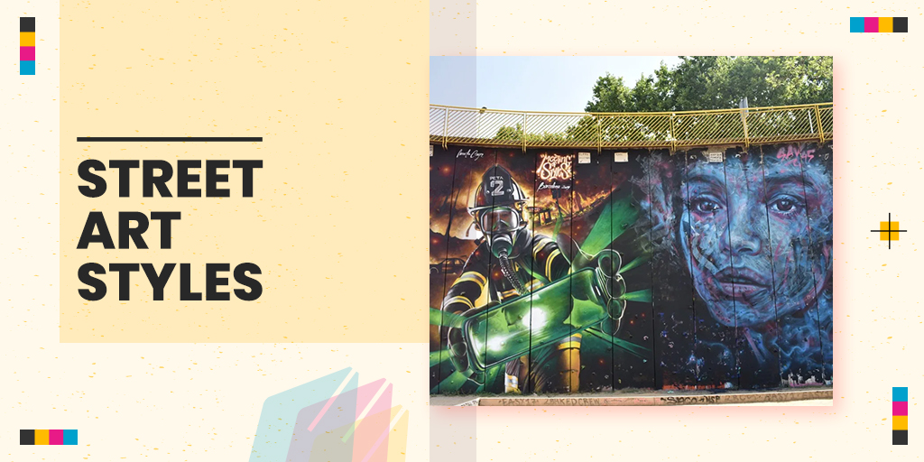
Graffiti and street art techniques have a retro appeal to them, conjuring up images of the 70s punk scene, the neon 80s, and the grungy 90s. But in 2020, this trend is more than your average comeback. Street art’s return to graphic design is ripe for our particular moment in time.
Over the past decade, learning design has become more accessible than ever before. That means there are a lot of new kids on the block who’ve had to make a name for themselves on their own, an ethos that fits well with the DIY aesthetic of street art.
2. Ultra-thin Geometry :
As a fundamental element of graphic design, lines express the form and nature of an object. Geometric lines illustrate objects that are man-made and technological, whereas curvy lines represent more natural and organic forms. In 2020, we are seeing designers merge these line styles to achieve impossible shapes. These designs are based on stable geometry, but they still manage to feel transient and ethereal. They look metallic but drift like smoke.
Ultra-thin geometry is sleek, abstract, and difficult to pull off without computer assistance, which is probably why it’s popular in tech and industrial branding. This style seems to express the future of technology—something less and less physical the deeper we venture into “the cloud”—and speak to the mysterious possibilities awaiting us in the coming years.
3. Paper cut-out collages :
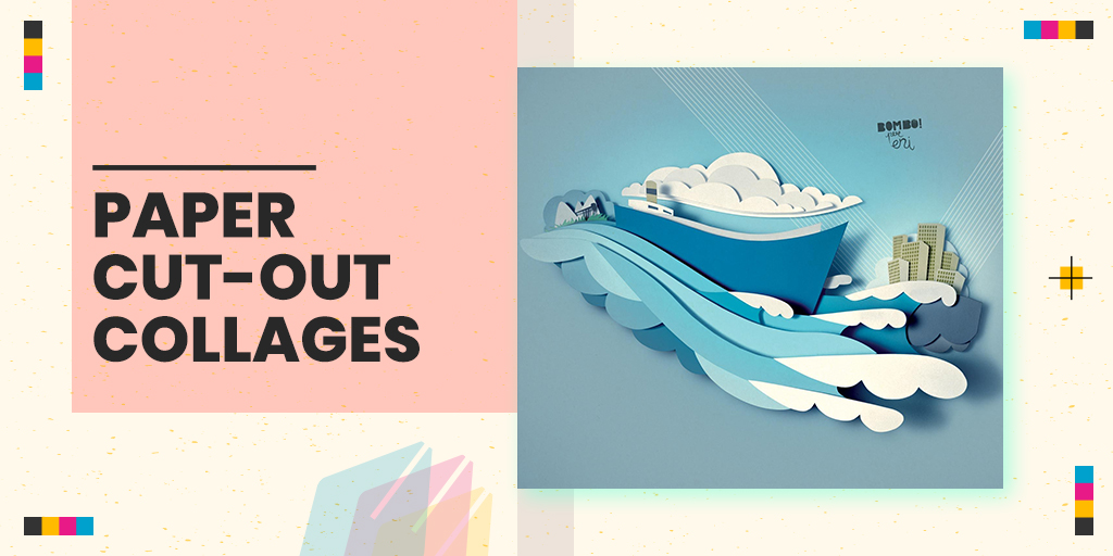
Designers are always trying to craft authentic experiences for viewers. What better way to do so than with literal arts and crafts?
Many collages try to trick the eye into seeing one cohesive image where several exist. But the collages of 2020 have nothing to hide. Designers are mixing images that clearly do not belong in the same universe, such as illustrations and photographs. Ditching seamless photo manipulation, they are leaving images with the angular edges and white outlines that come from quick-and-dirty cutting and pasting. The effect is to straddle the line between contrast and harmony, bringing together these disparate elements in a kind of asynchronous beauty.
4. Dystopian aesthetic :
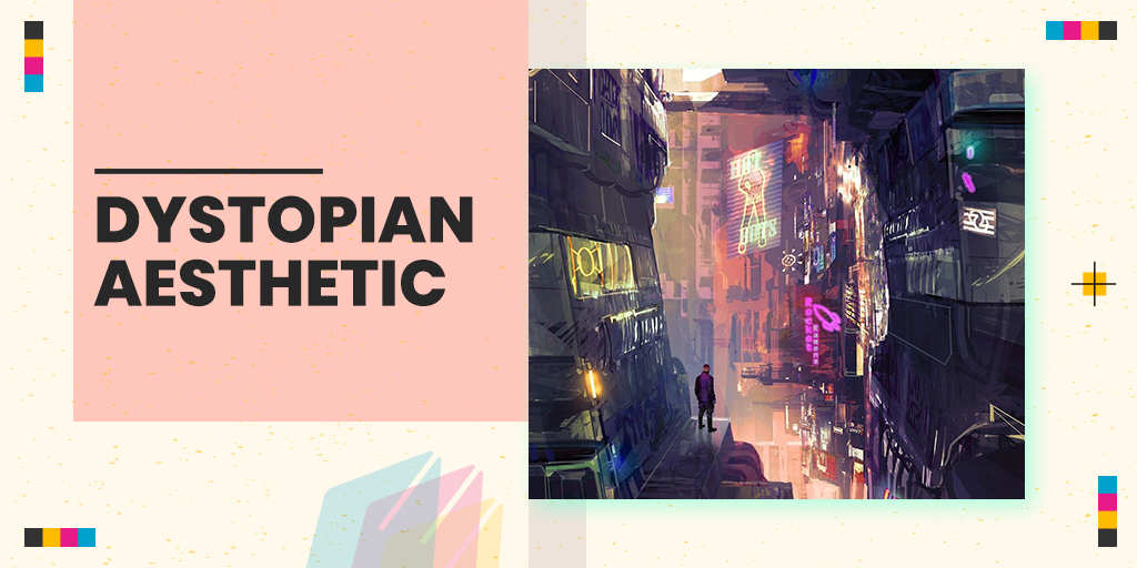
Thanks to our cultural obsession with shows like “Black Mirror” and “The Handmaid’s Tale,” dystopia is finding a voice in every medium imaginable. Dystopia (the opposite of utopia) generally refers to fictional, futuristic worlds that have taken a wrong turn somewhere in their history. From a design standpoint, dystopia finds expression through cold color schemes, mechanized typography, glitch art techniques, and imagery that merges tech with organic matter or excludes humans from the scene altogether.
Though the genre largely depicts a future gone wrong, things aren’t always as hopeless as it seems. Dystopia often takes the form of a cautionary tale, reminding us to keep our eyes open and wary. So far this trend shows up mostly in illustrative media such as album covers and t-shirts. While it can be unsettling, these styles are effective ways to get viewers to pause and reexamine the world around them.
Dystopia is a trend with something to say, and its popularity signals that in 2020 designers are grabbing the microphone.
5. Hyper-pastiche
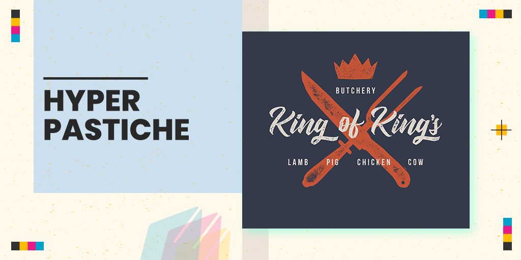
No graphic design trends list would be complete without a vintage-inspired look making some form of comeback. What makes 2020 unique is hyper-pastiche: designers won’t revive one specific era but pretty much all of them. Whether it’s Victorian or Medieval, Art Deco or Art Nouveau, past art styles are merging with modern designs in one massive chronological collage.
On one level, the graphic design trends 2020 is paying homage to their forebears. They’re seeking ways to redefine the digital aesthetic, and who better to turn to than the old masters? This is why an Art Nouveau flourish transforms what could be a basic letter mark for Madeline Jordan Photography into something special.
On another level, designers are taking advantage of the contrast between our digital images and past aesthetics to appeal to an old-world grandeur that is so often lost in vectorized simplicity. Bebop Guitar Series below gets the best of both worlds by fusing vector shapes with 1920s Harlem Renaissance abstraction.
6. Bevels and chisels :
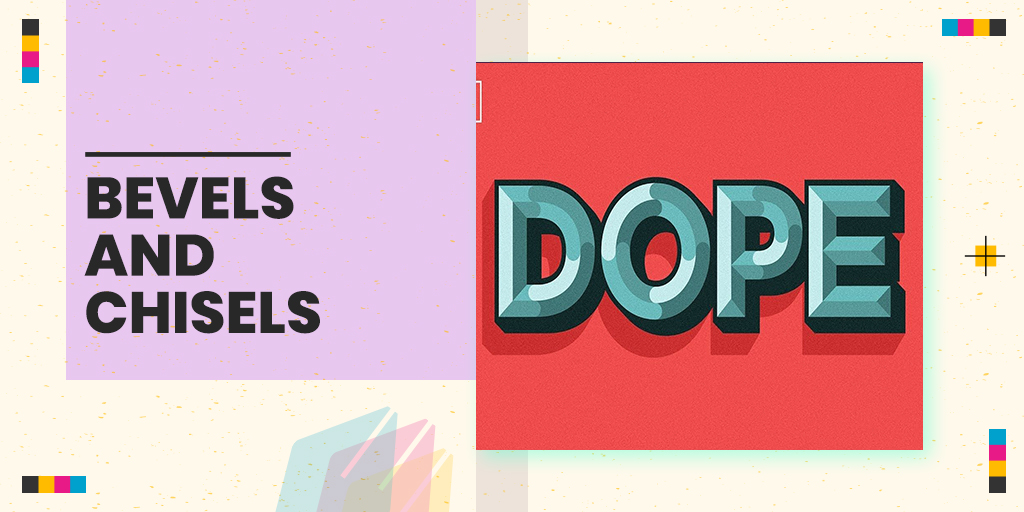
By creating 3D forms out of hard lines, the bevels and chisels trend harkens back to the classic struggle between skeuomorphism and flat design—except that designers have come up with a solution that incorporates both. On the skeuomorphic side, these designs subtly mimic real-life objects (like raised buttons, engraved coins or beveled stone), but they’re constructed out of flat colors. The end result is a flat image that looks tantalizingly real enough to touch.
3D stone-cutting techniques are particularly helpful in designs for digital scenarios, such as app icons and buttons. They create a tactile experience for users and mitigates the endless flatness that dominates the visual aesthetic of screens.


1 comment
Eric Jones
April 19, 2020 at 10:43 am
Good day,
My name is Eric and unlike a lot of emails you might get, I wanted to instead provide you with a word of encouragement – Congratulations
What for?
Part of my job is to check out websites and the work you’ve done with themesbox.in definitely stands out.
It’s clear you took building a website seriously and made a real investment of time and resources into making it top quality.
There is, however, a catch… more accurately, a question…
So when someone like me happens to find your site – maybe at the top of the search results (nice job BTW) or just through a random link, how do you know?
More importantly, how do you make a connection with that person?
Studies show that 7 out of 10 visitors don’t stick around – they’re there one second and then gone with the wind.
Here’s a way to create INSTANT engagement that you may not have known about…
Talk With Web Visitor is a software widget that’s works on your site, ready to capture any visitor’s Name, Email address and Phone Number. It lets you know INSTANTLY that they’re interested – so that you can talk to that lead while they’re literally checking out themesbox.in.
CLICK HERE http://www.talkwithwebvisitor.com to try out a Live Demo with Talk With Web Visitor now to see exactly how it works.
It could be a game-changer for your business – and it gets even better… once you’ve captured their phone number, with our new SMS Text With Lead feature, you can automatically start a text (SMS) conversation – immediately (and there’s literally a 100X difference between contacting someone within 5 minutes versus 30 minutes.)
Plus then, even if you don’t close a deal right away, you can connect later on with text messages for new offers, content links, even just follow up notes to build a relationship.
Everything I’ve just described is simple, easy, and effective.
CLICK HERE http://www.talkwithwebvisitor.com to discover what Talk With Web Visitor can do for your business.
You could be converting up to 100X more leads today!
Eric
PS: Talk With Web Visitor offers a FREE 14 days trial – and it even includes International Long Distance Calling.
You have customers waiting to talk with you right now… don’t keep them waiting.
CLICK HERE http://www.talkwithwebvisitor.com to try Talk With Web Visitor now.
If you’d like to unsubscribe click here http://talkwithwebvisitor.com/unsubscribe.aspx?d=themesbox.in